RHCNZ Group
New Zealand's leading radiology providers.
Design Lead
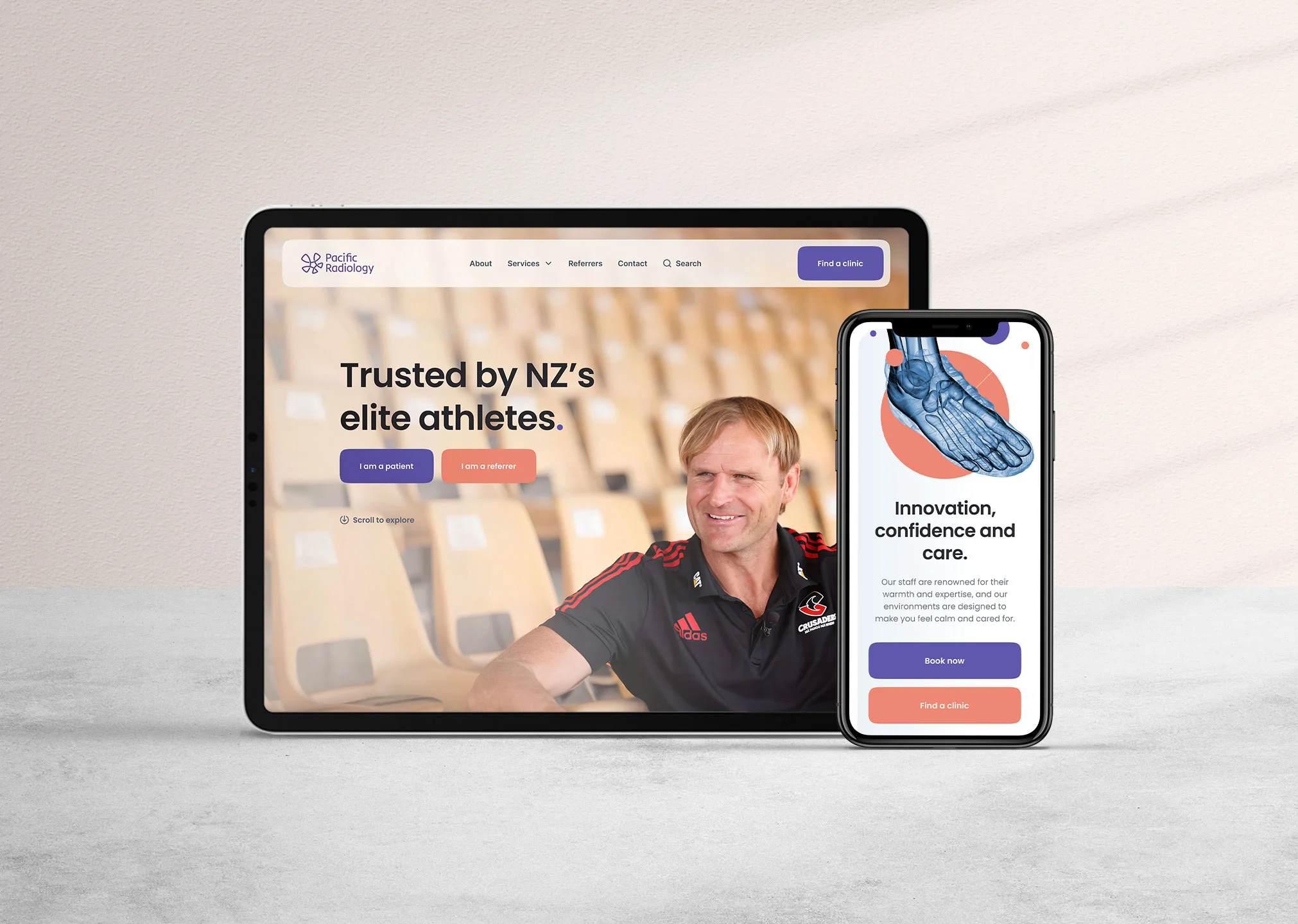
Design lead on a successful pitch for the redesign of all RHCNZ websites nationwide.
The primary goal was to establish a unified online platform that prioritised a consistent user experience for patients and healthcare professionals.


Design systems
To facilitate the smooth roll-out of designs across the three RHCNZ brands, I developed a comprehensive design system utilising Figma variables, component libraries, and detailed style guides for seamless handover to developers. By unifying the brands under one cohesive umbrella, we enhanced visual consistency, strengthened customer trust, and ensured brand coherence. This robust system accelerates development and provides the flexibility for future growth, enabling each brand to evolve consistently and professionally.

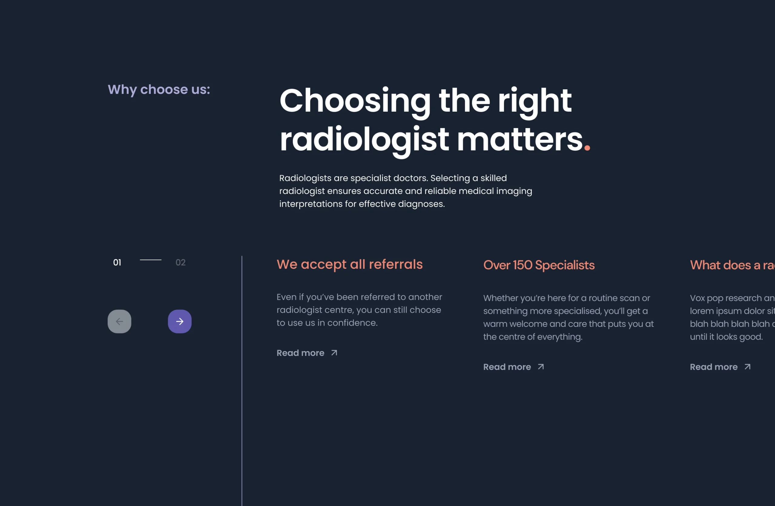
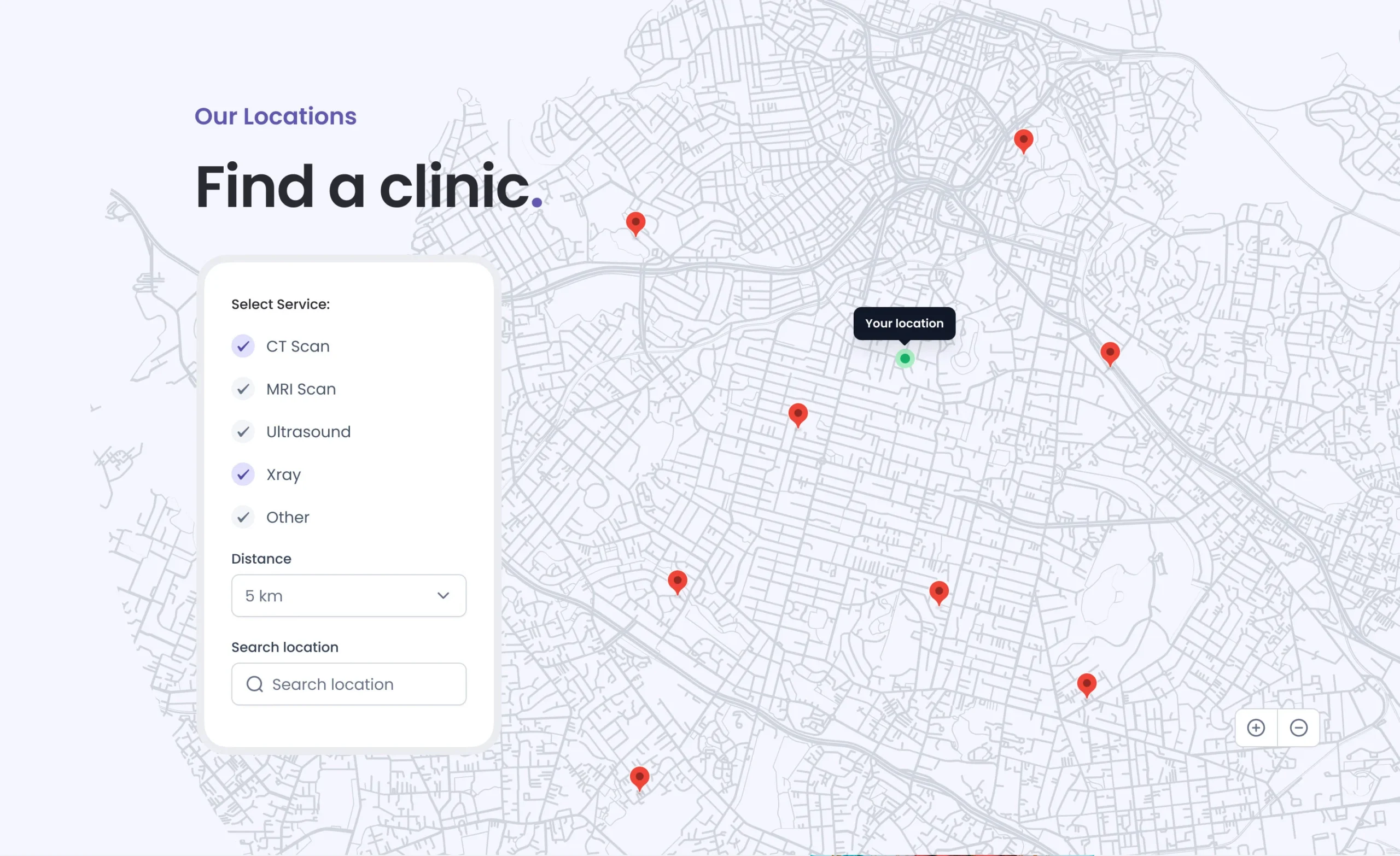

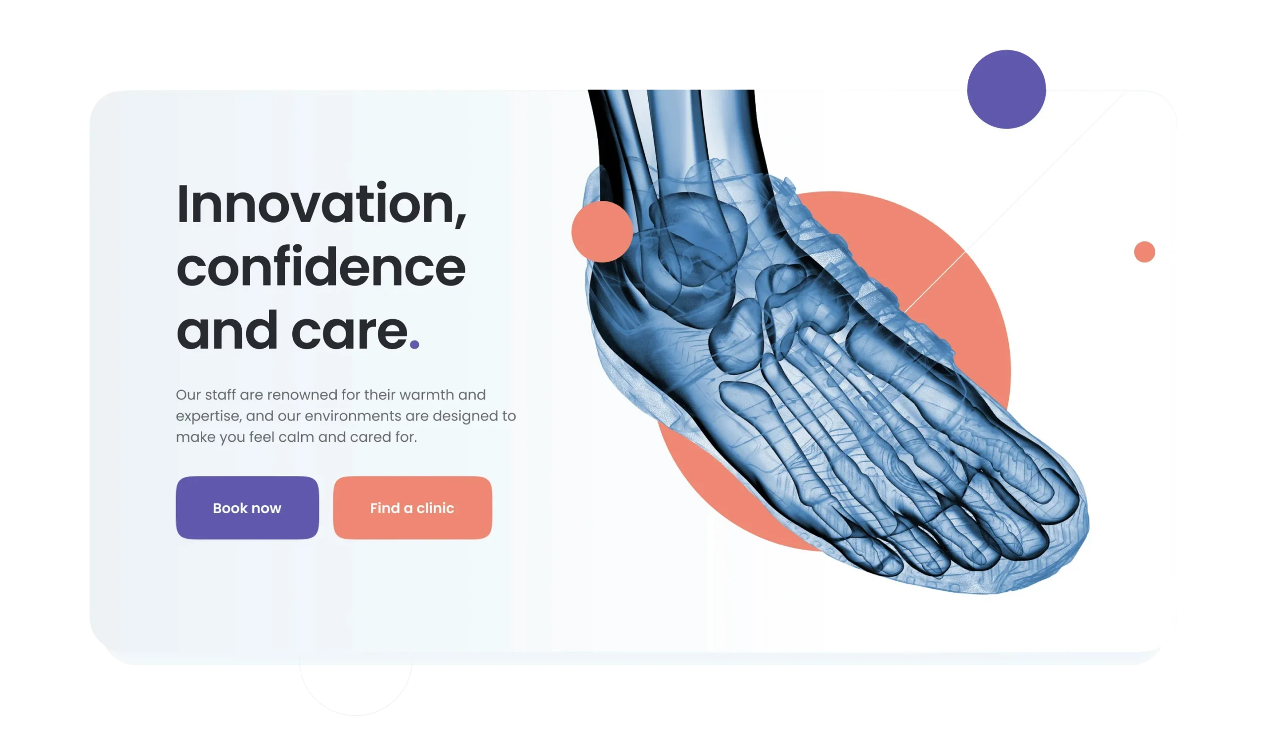


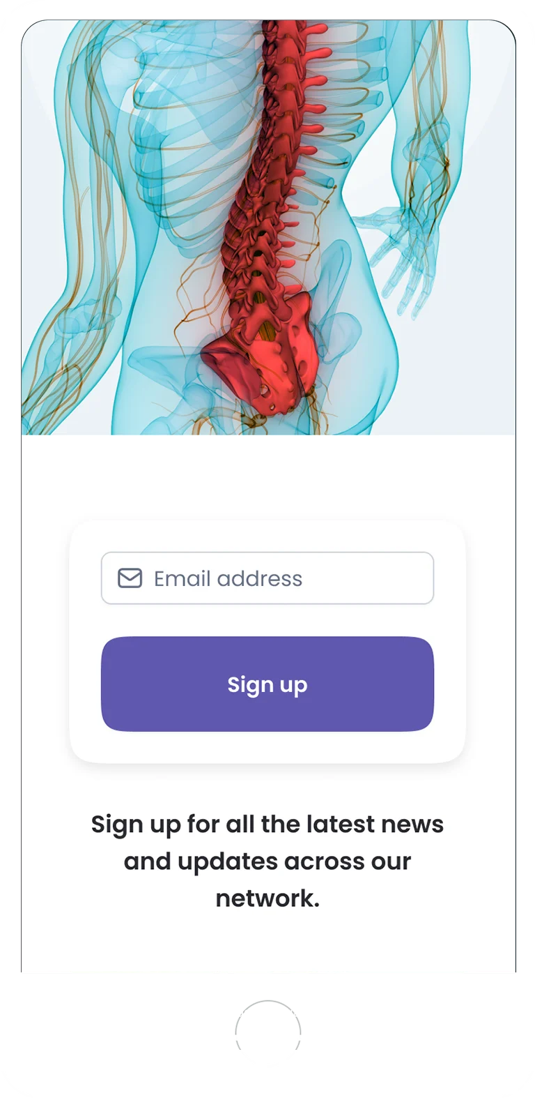
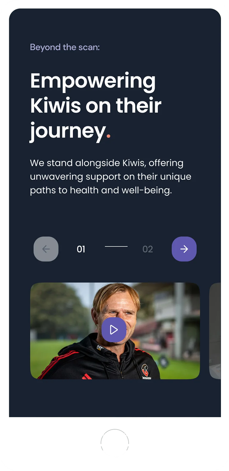
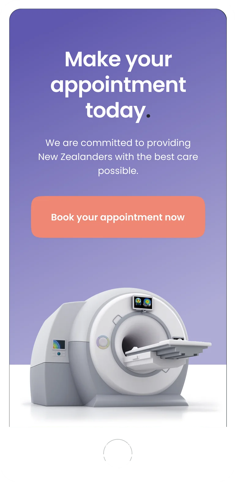


The overarching objective was to create a user-friendly, cutting-edge, and informative medical imaging website that catered to patients’ needs for booking, accessing images, obtaining clinic details, procedure information, invoice payments, and feedback.


Patient portal
The project included not only consumer-facing marketing sites but also a complete redesign of the patient portal. This portal allows patients to access their results, book appointments, view scans, and make payments, offering a seamless and user-friendly experience.
Background
As the design lead on a successful pitch for the redesign of all RHCNZ websites nationwide, I was tasked with developing a unified online platform that would offer a consistent and user-friendly experience for both patients and healthcare professionals across three distinct brands. The challenge was to create a cohesive design system that would not only streamline the user experience but also strengthen brand coherence and customer trust.
Objective
The primary objective was to create a cutting-edge, informative medical imaging website that catered to the needs of patients, allowing them to easily book appointments, access images, obtain clinic details, view procedure information, make payments, and provide feedback. Additionally, the project included a complete redesign of the patient portal to ensure a seamless and user-friendly experience.
Approach
To achieve these goals, I developed a comprehensive design system using Figma, incorporating variables, component libraries, and detailed style guides for a seamless handover to developers. This system was designed to unify the brands under one cohesive umbrella, enhancing visual consistency and ensuring that each brand could evolve consistently and professionally. I was also instrumental in building out the pitch document, which included innovative ‘blue-sky’ ideas such as AI integration to sell the concept. Throughout the project, I worked closely with key stakeholders to align on strategic goals and collaborated with cross-functional teams to ensure a smooth rollout of the designs.
Outcome
The pitch was successful, and we are currently in the rollout phase of creating the new websites. The unified design system has accelerated development, provided flexibility for future growth, and strengthened customer trust across all three brands. The project’s success is a testament to the value of a well-executed design system and the importance of collaboration in achieving strategic objectives.
